


有間工程行Yu Jian
品牌標誌設計
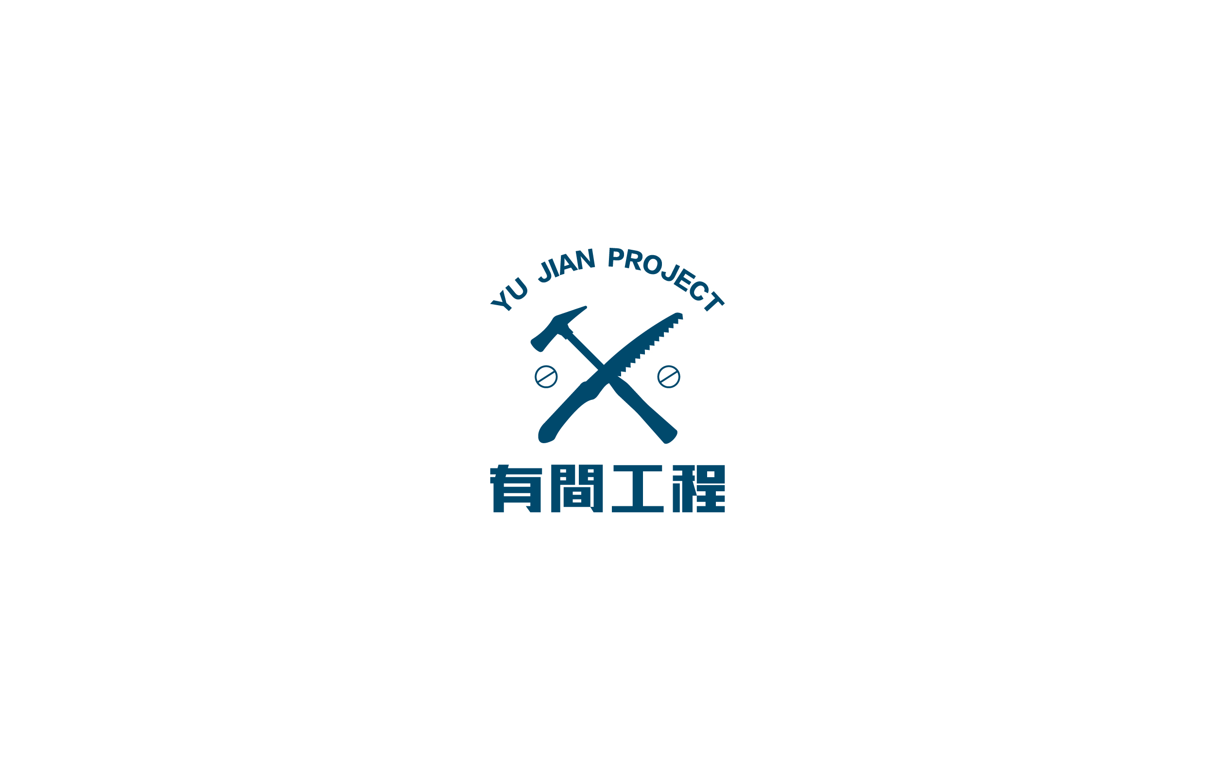
業主是一位年輕的創業者,想將自身的產業跟大多的同行做出視覺上的區隔,客戶希望使用他們最常使用的工具來做整個標誌的起頭,當中我們也討論了很多關於此類型的標誌如何做會更直覺。
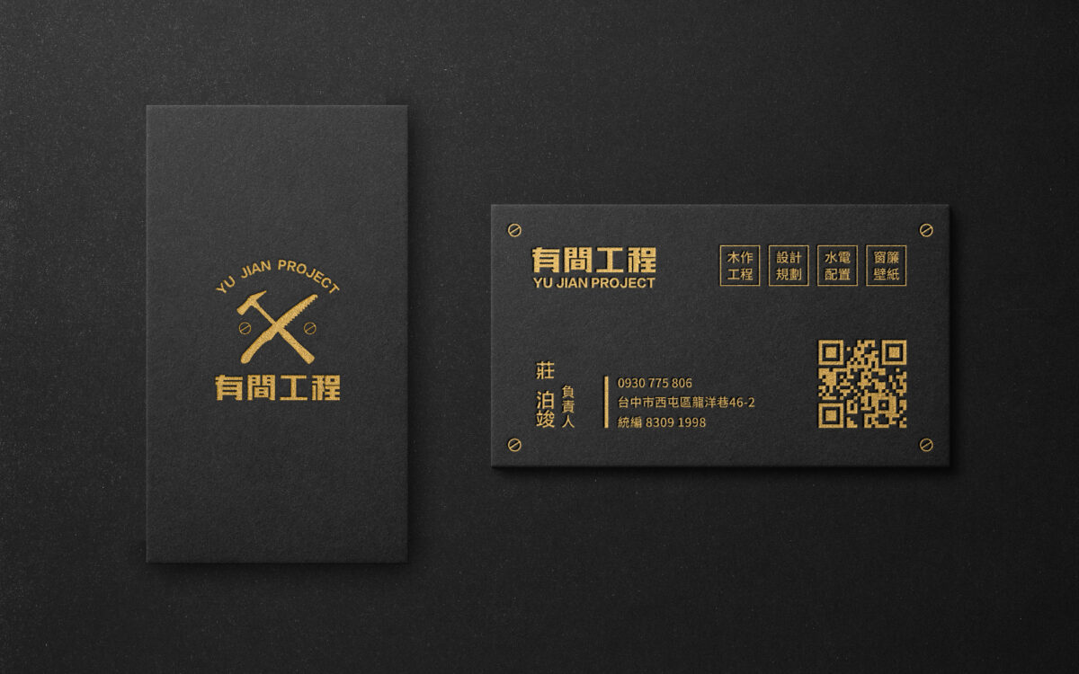
在名片上我們做出兩種版本的區隔,公司負責人使用黑色的厚紙搭配燙金,目標用於各類型商務的聚會上使用,以燙金的形式襯托其高級感進而與品質做上連結,業務人員則使用合板印刷以縮減成本開支,顏色上則使用藍色比較明亮年輕的色彩來呈現。
The owner is a young entrepreneur who wants to make a visual distinction between his industry and most of his peers. The client wanted to use the tool they use most often to start the whole logo, and we discussed a lot about how to make this type of logo more intuitive.
For the business card, we made two versions of differentiation: the company manager used thick black paper with foil stamping, aiming to be used in various types of business gatherings, with the form of foil stamping to set off its high class feeling and then link it with quality, while the salesman used plywood printing to reduce the cost, and the color was presented in a brighter and younger color than blue.
- 客戶有間工程行
- 專案時間2020
- 領域類別品牌標誌logo設計、平面設計