
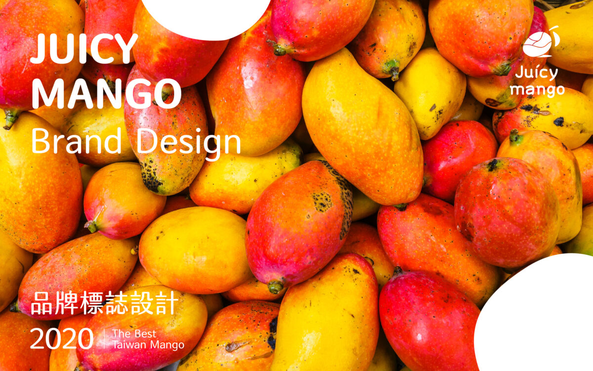


JUICY MANGO 品牌標誌設計
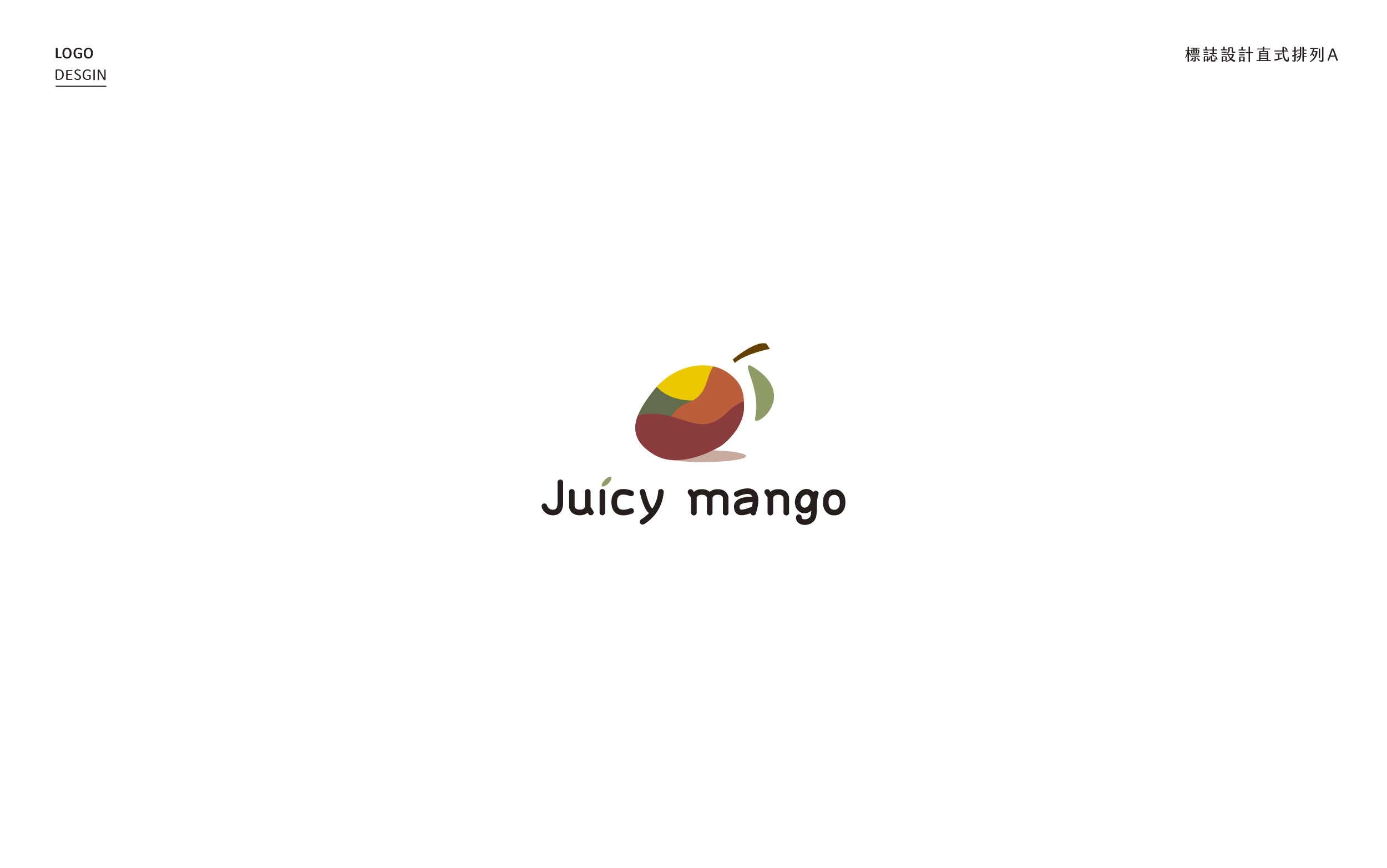
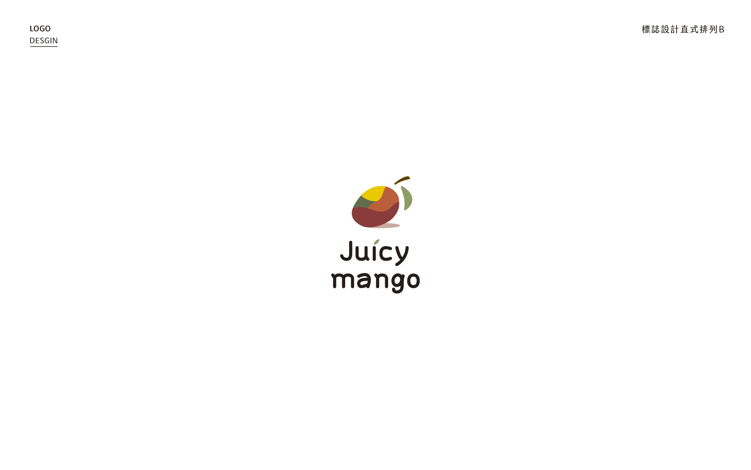
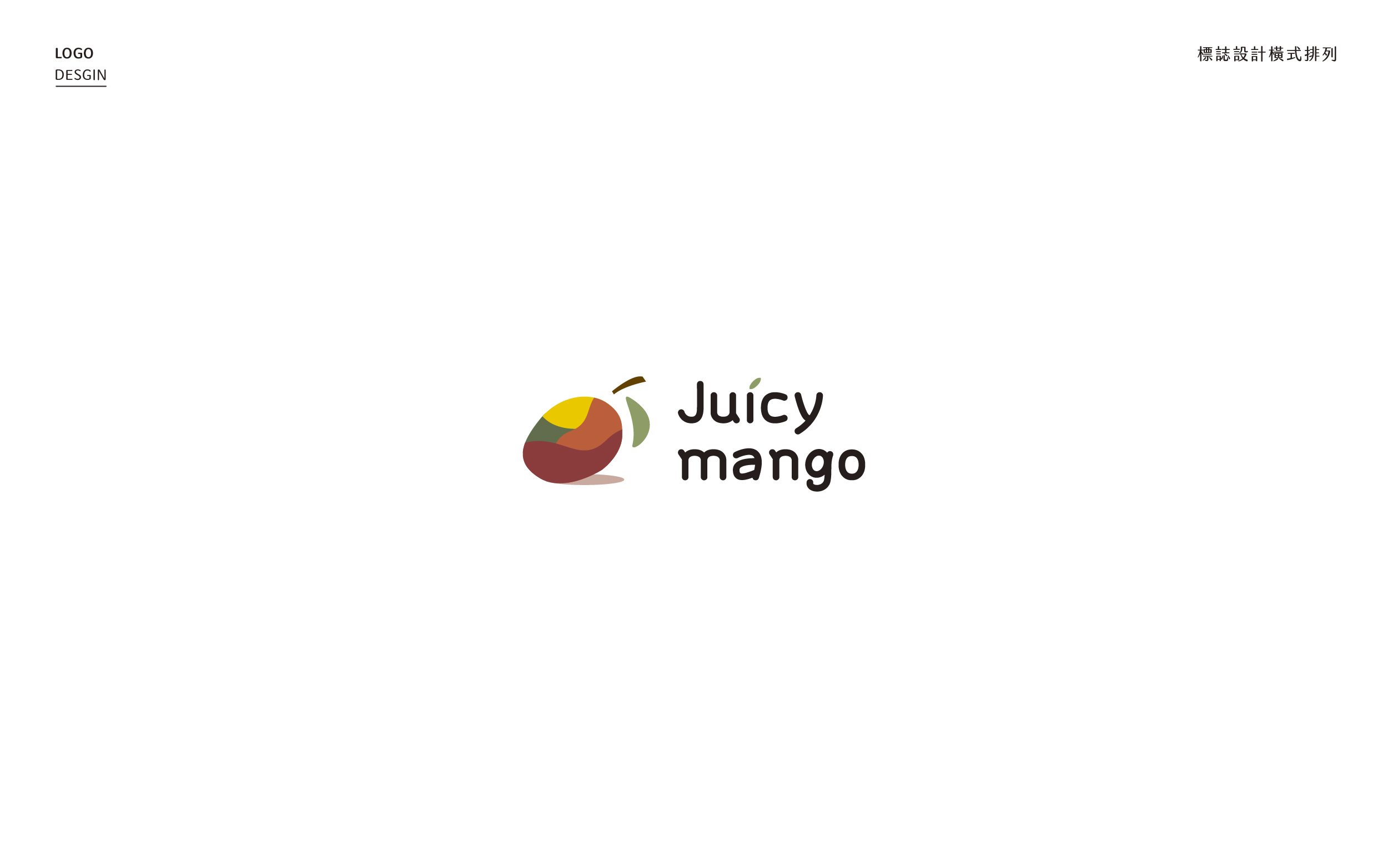
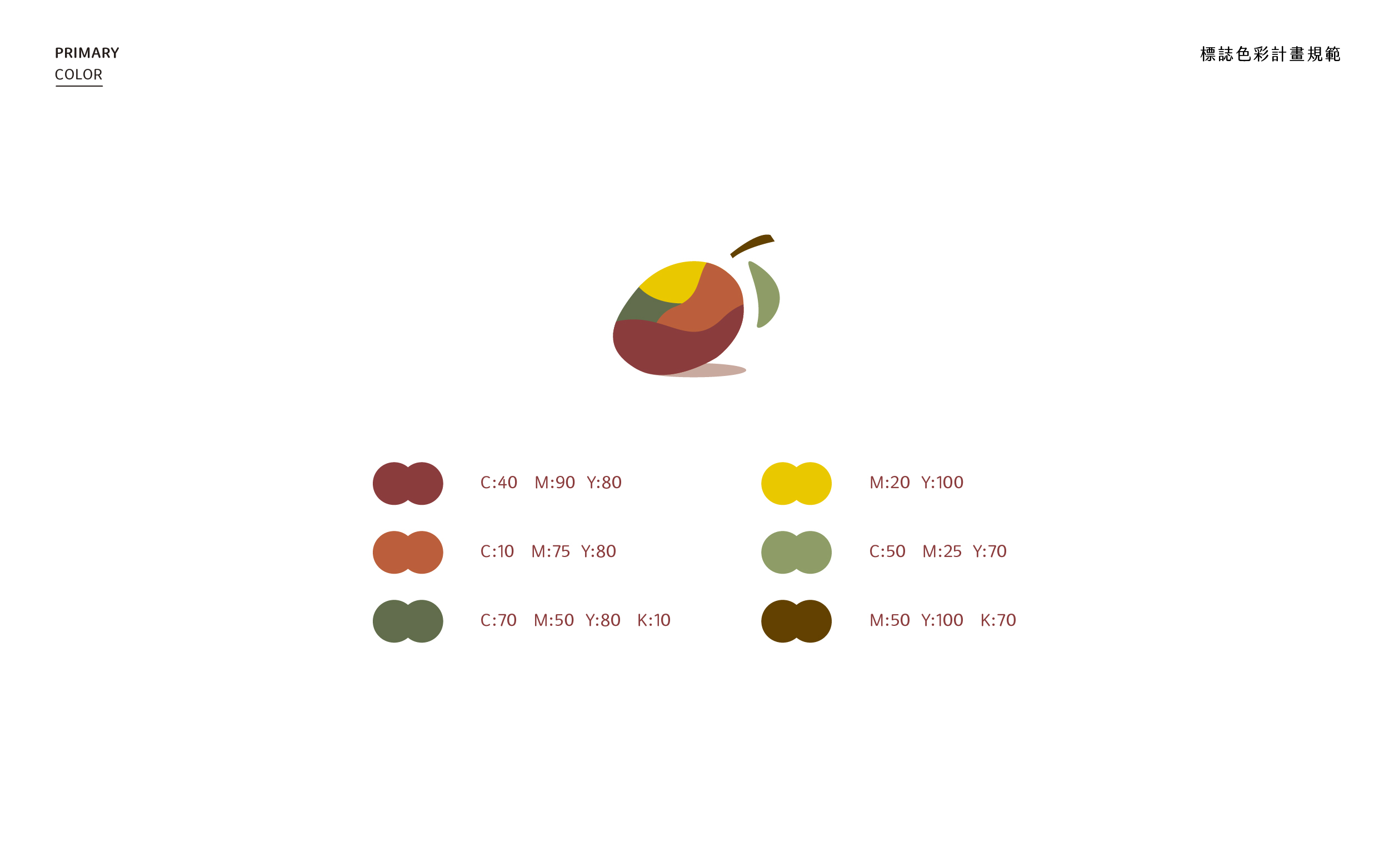
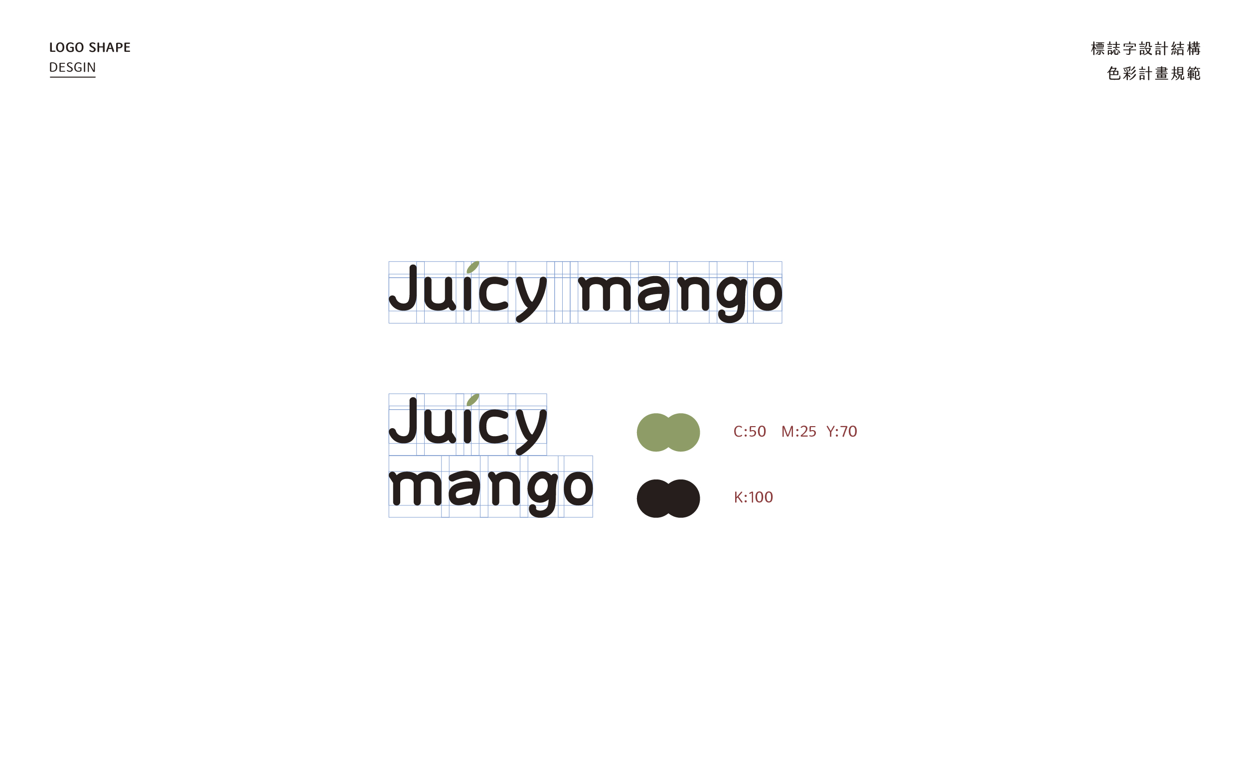
位於台灣最南端的芒果盛產地,來自枋山的芒果,在幾次的對談後我們在標誌上的設定採用比較直覺的設計,整體logo標誌的標準色則是依據芒果在初成果實到熟成果實四個階段的顏色來設定,在標準字的作法上則是在起筆跟彎角的採用比較圓潤的方式以呼應芒果的外型。
名片設計的區塊在整體視覺上同樣依據標準色來製作各種幾何圖案來強化畫面感,在背面資訊的部分,因為考量到必須符合大眾的視覺動線所以採用比較規整的方式排版。
Located in the southernmost mango-producing area of Taiwan, the mangoes from Fang Mountain, after several conversations, we adopted a more intuitive design for the logo.
The standard color of the logo is set according to the four stages of mangoes from the first fruit to the ripe fruit, and the standard wording is rounded in the starting stroke and corner to echo the appearance of mangoes.
The overall visual aspect of the business card design is also based on the standard colors to create various geometric patterns to enhance the sense of painting.
- 客戶菓菓芒農産行
- 專案時間2020
- 領域類別品牌標誌logo設計、平面設計